NB: this is part of a workshop that I taught recently with TRR356/LRZ
options(readr.show_col_types=F)
A further tour of the ggplot-iverse
This section of the workshop will be slightly different. As someone new to ggplot, it is often hard to learn what is possible with the enormous ecosystem of packages related to plotting in R. So, for the following section, I’ll give a small tour of both more advanced parts of ggplot, as well as some additional packages for plotting special data types.
The aim here is not to teach you specifically how to make each of these plots, more to show you some of the things that are possible with ggplot and related packages, and hopefully give you something to Google should you need to make such plots yourself.
More gg-goodies!
As we have spoken about previously, the ggplot2 package(s) provide plotting functionality, heavily integrated with the concept of tidy data and the tidyverse.
Let’s load these basic packages now.
library(tidyverse)
library(ggplot2)

# Remember themes? We can set a default theme for all plots with `theme_set()`!
theme_set(theme_bw())
Facets, panels, and marginal plots
Reminder: the MPG dataset – stats on car models.
mpg %>%
glimpse()
## Rows: 234
## Columns: 11
## $ manufacturer <chr> "audi", "audi", "audi", "audi", "audi", "audi", "audi", "…
## $ model        <chr> "a4", "a4", "a4", "a4", "a4", "a4", "a4", "a4 quattro", "…
## $ displ        <dbl> 1.8, 1.8, 2.0, 2.0, 2.8, 2.8, 3.1, 1.8, 1.8, 2.0, 2.0, 2.…
## $ year         <int> 1999, 1999, 2008, 2008, 1999, 1999, 2008, 1999, 1999, 200…
## $ cyl          <int> 4, 4, 4, 4, 6, 6, 6, 4, 4, 4, 4, 6, 6, 6, 6, 6, 6, 8, 8, …
## $ trans        <chr> "auto(l5)", "manual(m5)", "manual(m6)", "auto(av)", "auto…
## $ drv          <chr> "f", "f", "f", "f", "f", "f", "f", "4", "4", "4", "4", "4…
## $ cty          <int> 18, 21, 20, 21, 16, 18, 18, 18, 16, 20, 19, 15, 17, 17, 1…
## $ hwy          <int> 29, 29, 31, 30, 26, 26, 27, 26, 25, 28, 27, 25, 25, 25, 2…
## $ fl           <chr> "p", "p", "p", "p", "p", "p", "p", "p", "p", "p", "p", "p…
## $ class        <chr> "compact", "compact", "compact", "compact", "compact", "c…
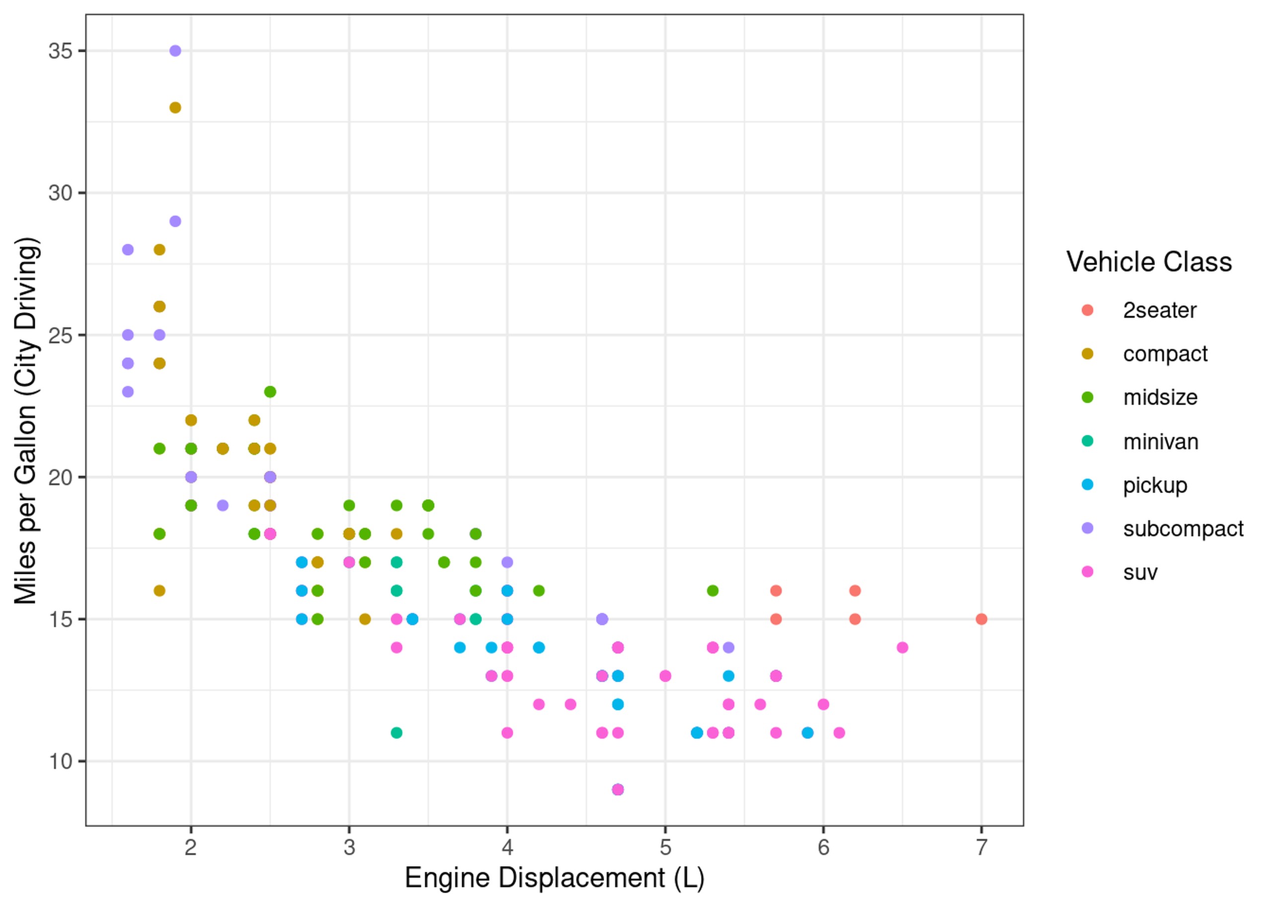
mpg %>%
  ggplot(aes(x=displ, y=cty)) +
  geom_point(aes(colour=class)) +
  labs(x="Engine Displacement (L)", y="Miles per Gallon (City Driving)", colour="Vehicle Class")
mpg %>%
  ggplot(aes(x=displ, y=cty)) +
  geom_point(aes(colour=class, shape=drv)) +
  labs(x="Engine Displacement (L)", y="Miles per Gallon (City Driving)", colour="Vehicle Class", shape="Drive Mode")
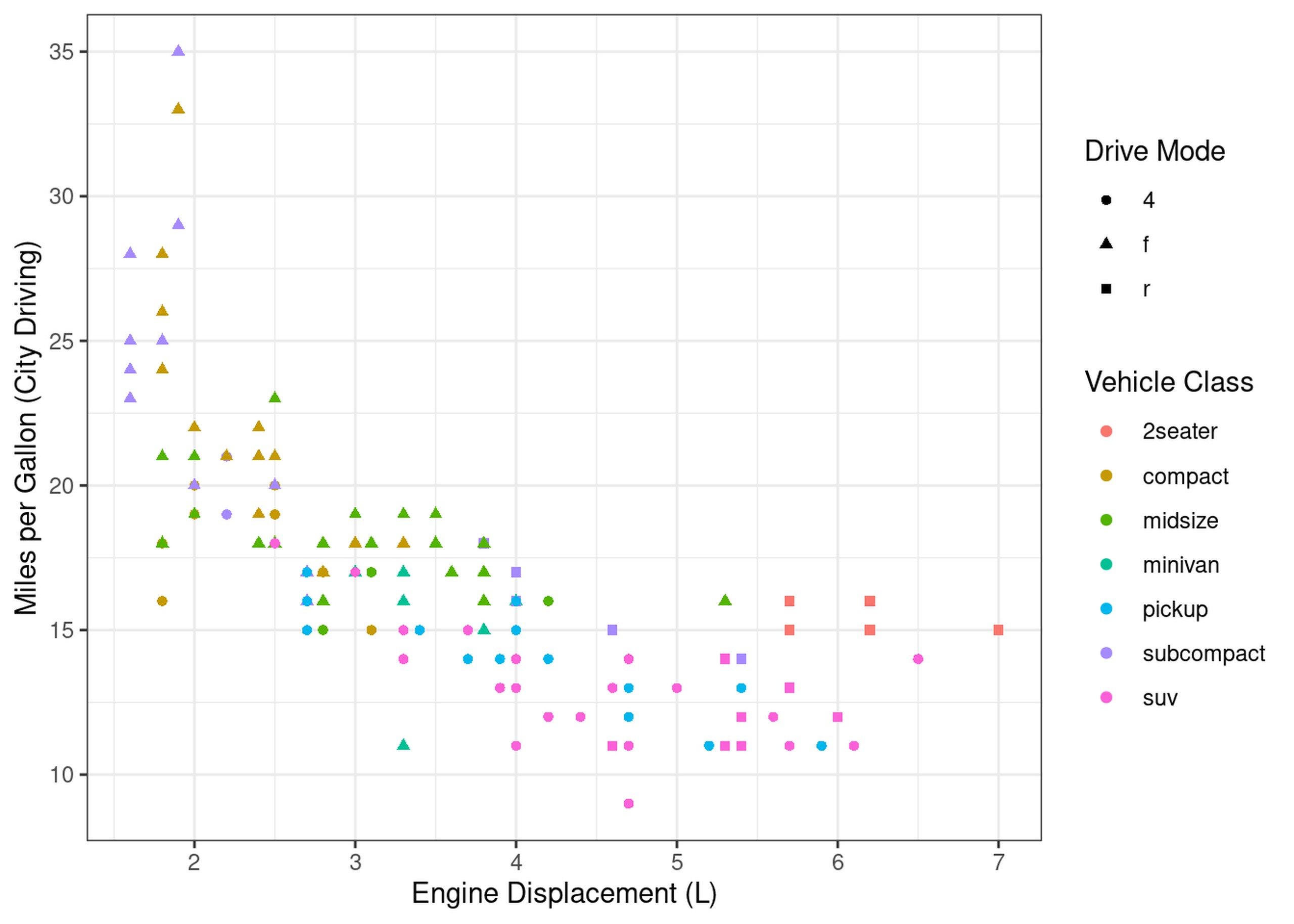
What we need is a way to make separate plots per drive mode. This is exactly what facets are:
mpg %>%
  ggplot(aes(x=displ, y=cty)) +
  geom_point(aes(colour=class)) +
  facet_wrap(~drv, labeller = as_labeller(c("4"="Four-wheel Drive", f="Front Drive", "r"="Rear Drive")),
             scales="free") +
  labs(x="Engine Displacement (L)", y="Miles per Gallon (City Driving)", colour="Vehicle Class")
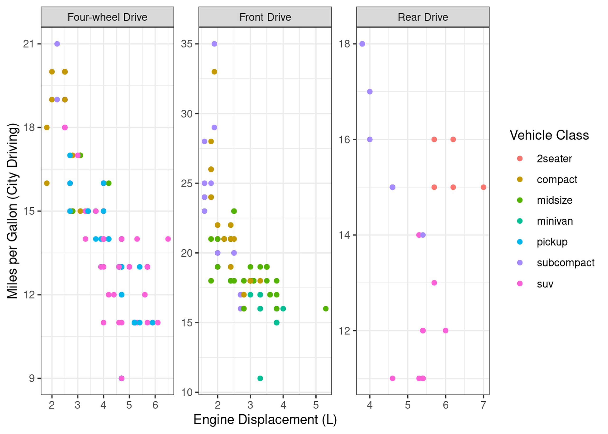
Brilliant, now we have a plot per drive mode.
Unfortunately, we can’t always simply compose subplots into a figure using a simple facet. Perhaps we want to show two different types of plot, or we need to combine two different data types. In these cases, we need to do things a bit more manually, and use an extra package.
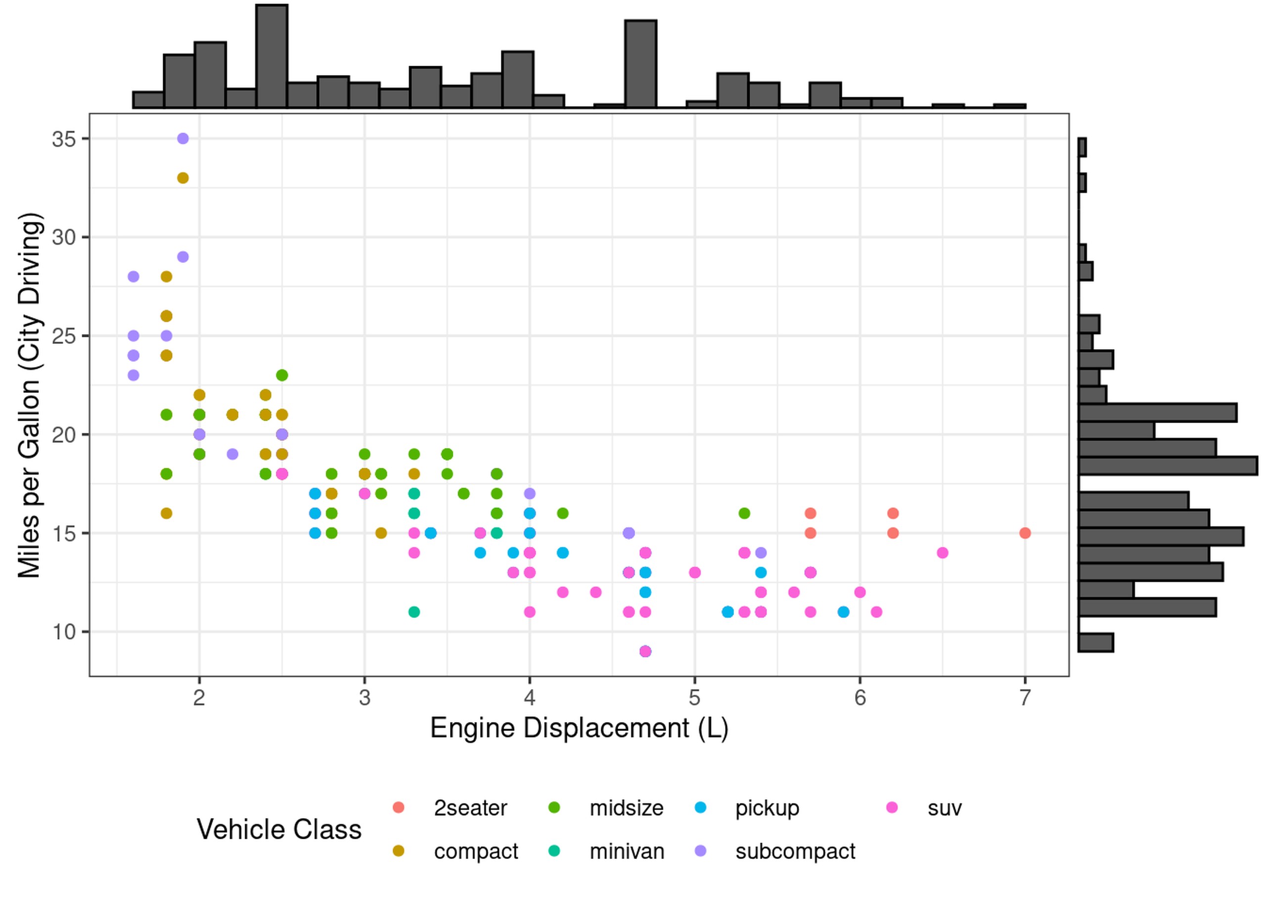
Let’s say we want to see a marginal histogram on each axis of our first scatter plot:
scatter_displ_cty = mpg %>%
  # NB: I'm saving this plot as an object named scatter_displ_city so we can use it later
  ggplot(aes(x=displ, y=cty)) +
  geom_point(aes(colour=class)) +
  labs(x="Engine Displacement (L)", y="Miles per Gallon (City Driving)", colour="Vehicle Class")
 # as "saved for later" plots aren't shown, you need to manually print them to actually see it
print(scatter_displ_cty)

Happily, the ggMarginal package from ggExtra is able to easily add
these!
ggExtra::ggMarginal(scatter_displ_cty + theme(legend.position = "bottom"),
                    # Note: we put the legend on the bottom, or it looks funny with the histogram
                    type="histogram")
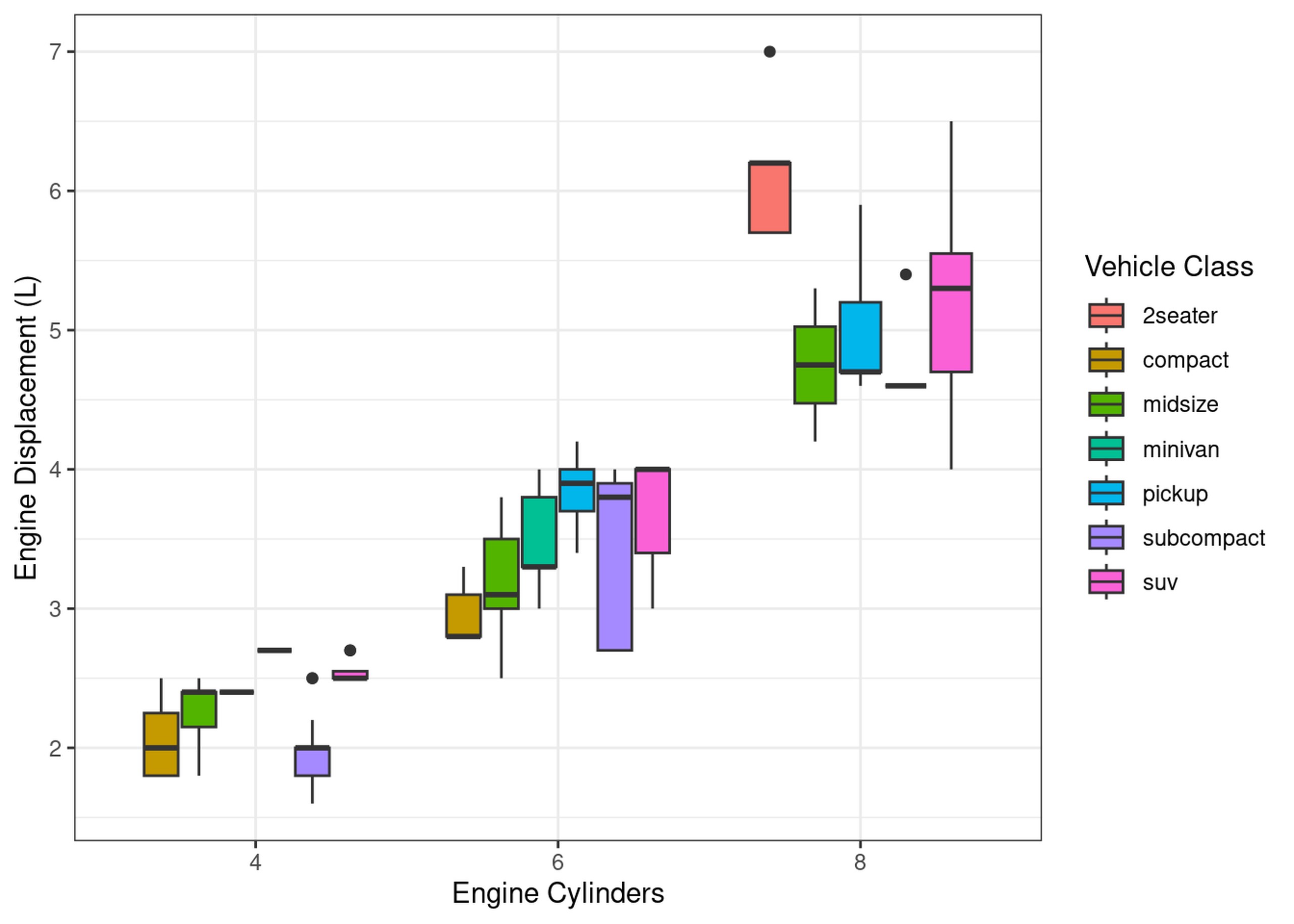
Often however, we want to compose a figure from a few completely different plots. For example, we might want to inspect not just the relationship between MPG and Engine Displacement, but also between displacement and how many cylinders each engine has.
scatter_cyl_displ = mpg %>%
  filter(cyl!=5) %>%
  ggplot(aes(x=as.factor(cyl), y=displ)) +
  geom_boxplot(aes(fill=class)) +
  labs(x="Engine Cylinders", y="Engine Displacement (L)", fill="Vehicle Class")
print(scatter_cyl_displ)
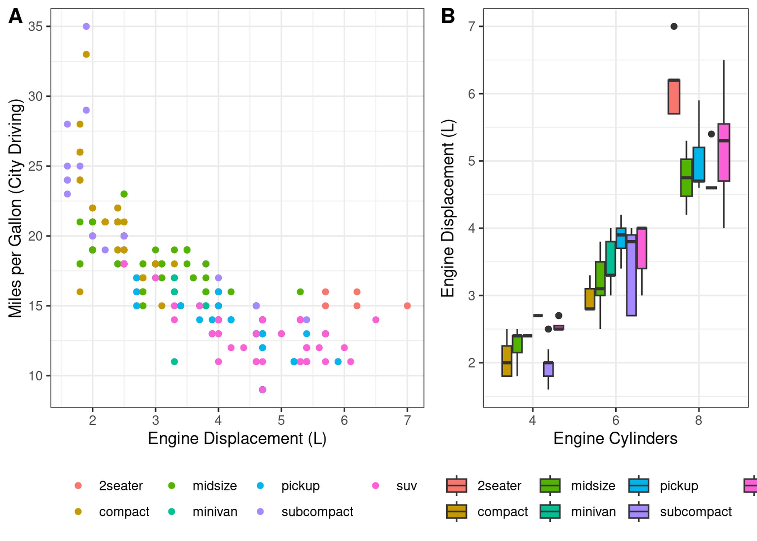
We can compose these two plots into a single figure using the cowplot
package
noleg = theme(legend.position = "bottom", legend.title  = element_blank()) # tweak the legend

cowplot::plot_grid(
  scatter_displ_cty + noleg , scatter_cyl_displ + noleg,
  align="v", nrow=1, labels=c("A", "B"), rel_widths = c(4, 3)
)
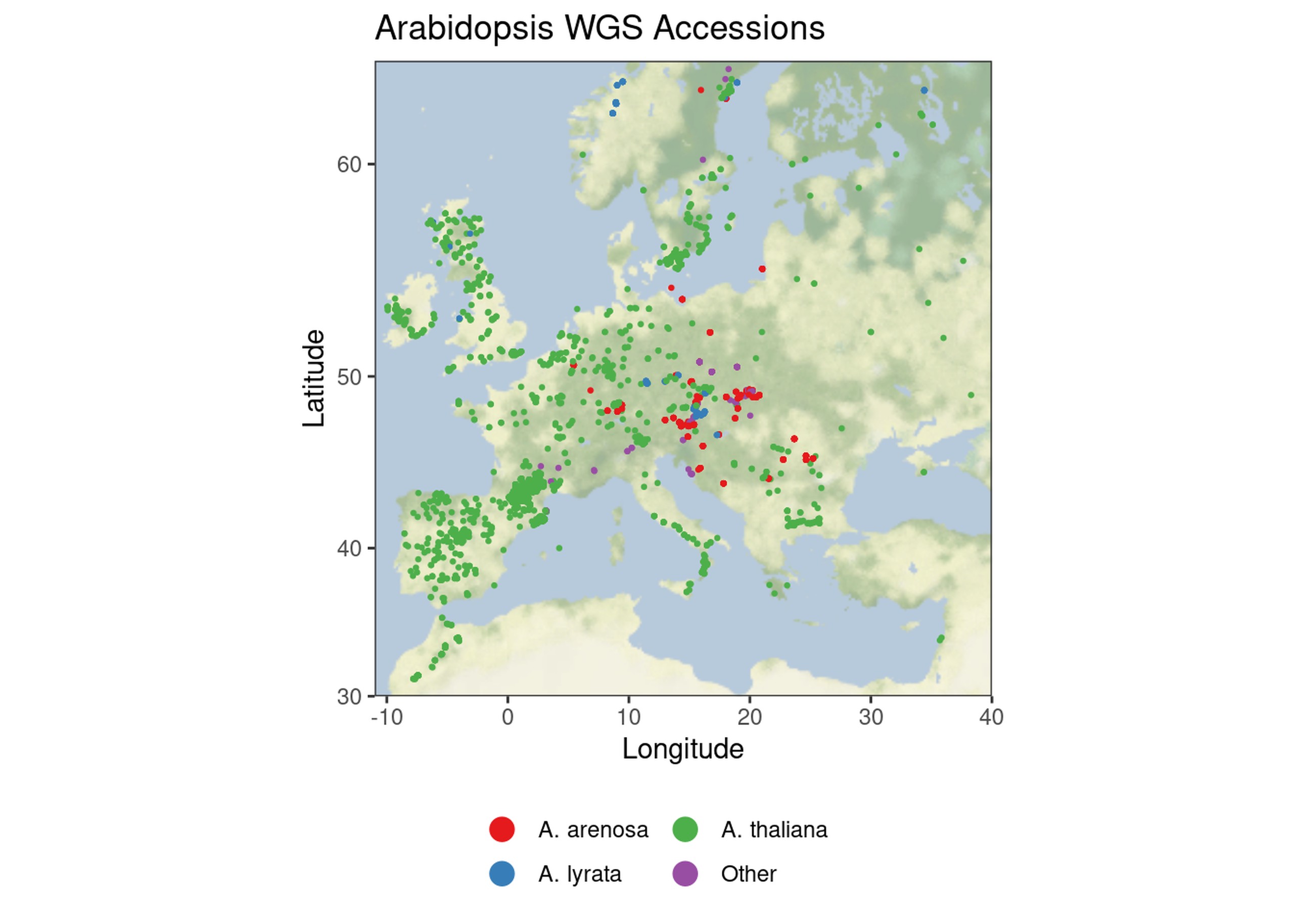
ggmaps
While ggplot itself is by-and-large limited to statistical plots, there are a wide range of extension packages that allow plotting other data types. The first we will cover is geospatial data, in particular plotting observations on a map.
# For now please install from github, but hopefully version 4 will be out soon fixing https://github.com/dkahle/ggmap/issues/350
#remotes::install_github("stadiamaps/ggmap")
ath = read_csv("data/ath.csv") %>%
  filter(!grepl("Cardamine", species)) %>%
  mutate(
    species = case_when(
      species %in% c("Arabidopsis thaliana", "Arabidopsis arenosa") ~ species,
      grepl("Arabidopsis lyrata", species) ~"Arabidopsis lyrata",
      T ~ "Other"
    ) %>%
    sub("Arabidopsis", "A.", .)
  ) %>%
  filter(!is.na(latitude))
glimpse(ath)
## Rows: 4,070
## Columns: 6
## $ id        <chr> "OAKG0088", "OAKG0108", "OAKG0139", "OAKG0159", "OAKG0265", …
## $ dataset   <chr> "KG", "KG", "KG", "KG", "KG", "KG", "KG", "KG", "KG", "KG", …
## $ species   <chr> "A. thaliana", "A. thaliana", "A. thaliana", "A. thaliana", …
## $ locality  <chr> "CYR", "LDV", "LDV", "Mar2", "PYL", "TOU-A1", "TOU-A1", "Zda…
## $ latitude  <dbl> 47.4000, 48.5167, 48.5167, 47.3500, 44.6500, 46.6667, 46.666…
## $ longitude <dbl> 0.683333, -4.066670, -4.066670, 3.933330, -1.166670, 4.11667…
# first, define a bounding box
bbox=c(left=-11, right=40, top=64, bottom=30)

# Register with the stadia map service. You need to create a free account if you want to
# use this in your research,  the below is a testing key.
ggmap::register_stadiamaps("070cf85d-47f8-4b8a-bc73-aff5dfa5c613")


basemap = ggmap::get_stadiamap(bbox, zoom = 3, maptype = "stamen_terrain_background")
## ℹ © Stadia Maps © Stamen Design © OpenMapTiles © OpenStreetMap contributors.
# Plot map, adding a point for each plant
ggmap::ggmap(basemap, darken=c(0.3, "white")) +
  geom_point(aes(longitude, latitude, colour=species), data=ath, size=0.5) +
  guides(colour=guide_legend(override.aes = list(size=4), title = NULL, ncol=3)) +
  scale_colour_brewer(palette="Set1") +
  labs(x="Longitude", y="Latitude", title="Arabidopsis WGS Accessions") +
  theme(legend.position = "bottom")
## Warning: Removed 984 rows containing missing values (`geom_point()`).
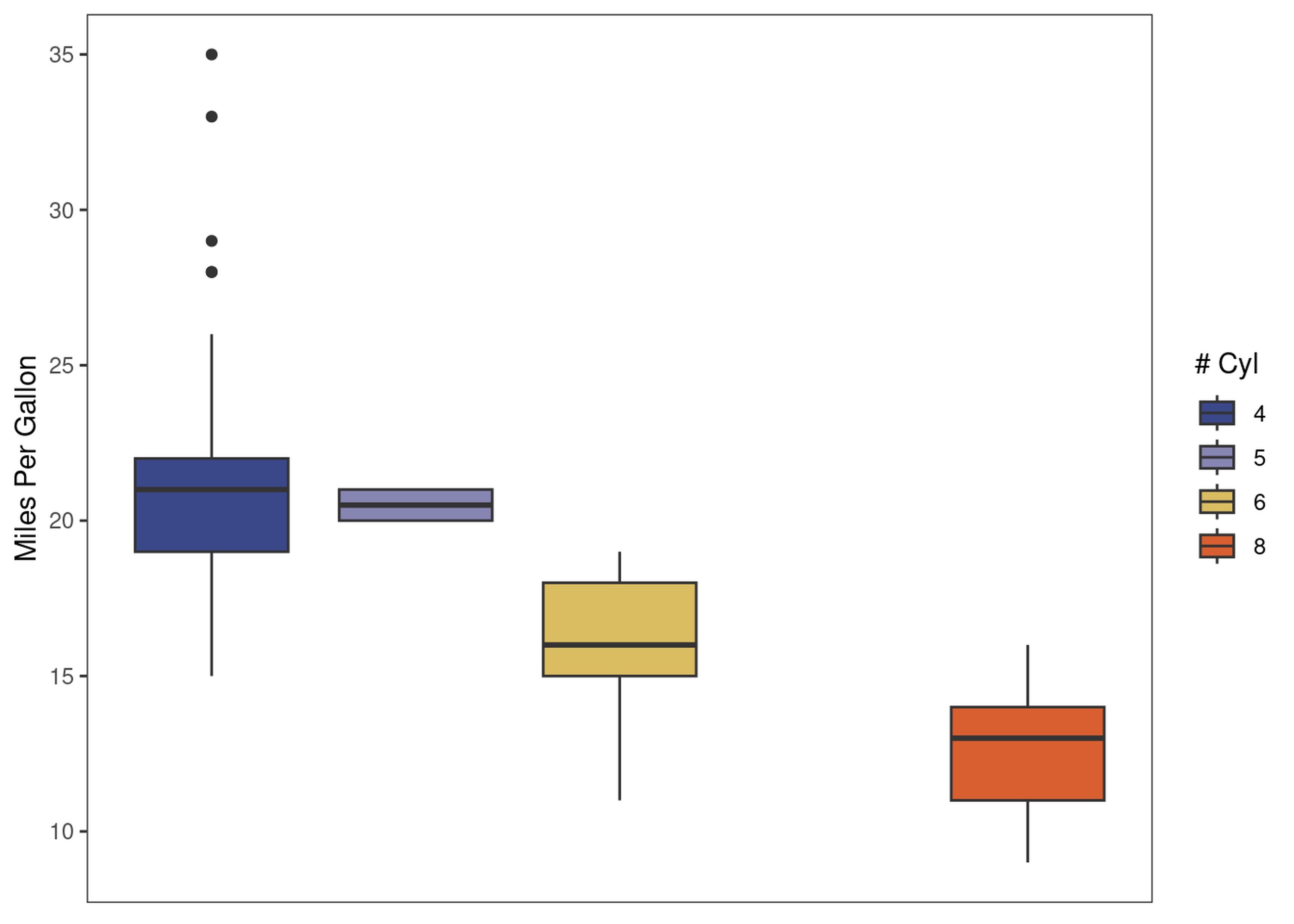
One challenge in a lot of plots is to find a decent colour scheme. I
highly recommend you read this Nature paper (Crameri et
al. 2020) on the
use of colour in scientific communication. Generally speaking, I’d
advice using a palette meta-package like
paletteer, which
contain a large number of pre-made palettes, which you can pick from
galleries like the one I linked above. If you really can’t find anything
you like, one can use tools like
chroma.js to design a colour palette
with nice properties like perceptual uniformity based on a few
hand-picked anchor colours.
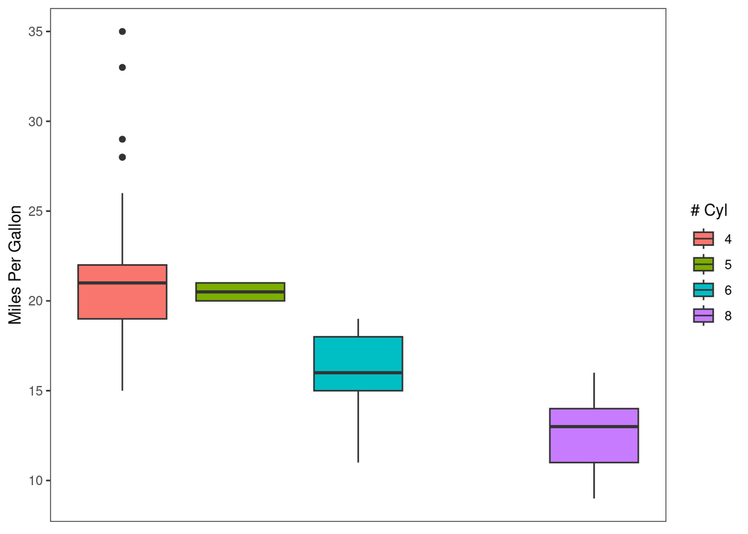
explot = ggplot(mpg, aes(y=cty, x=cyl)) +
  geom_boxplot(aes(fill=as.factor(cyl))) +
  theme(panel.grid = element_blank(),
        axis.text.x = element_blank(),
        axis.ticks.x = element_blank()) +
  labs(y="Miles Per Gallon", x=NULL, fill="# Cyl")
print(explot)
explot +
  paletteer::scale_fill_paletteer_d("lisa::OskarSchlemmer")
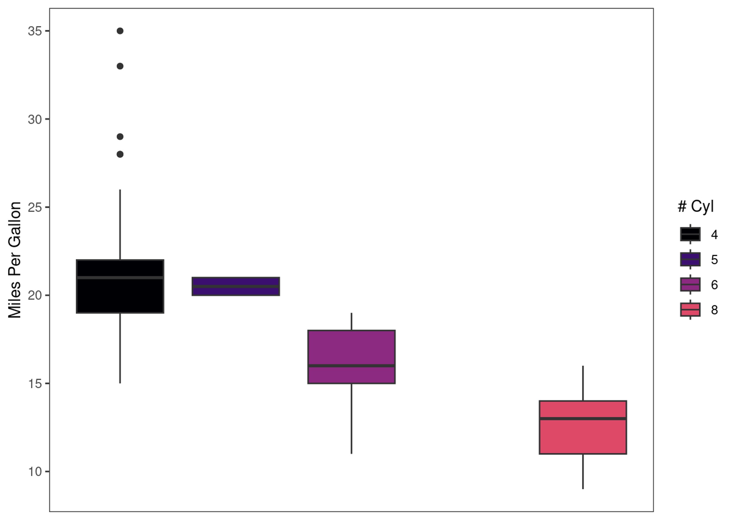
explot +
  paletteer::scale_fill_paletteer_d("ggprism::magma")
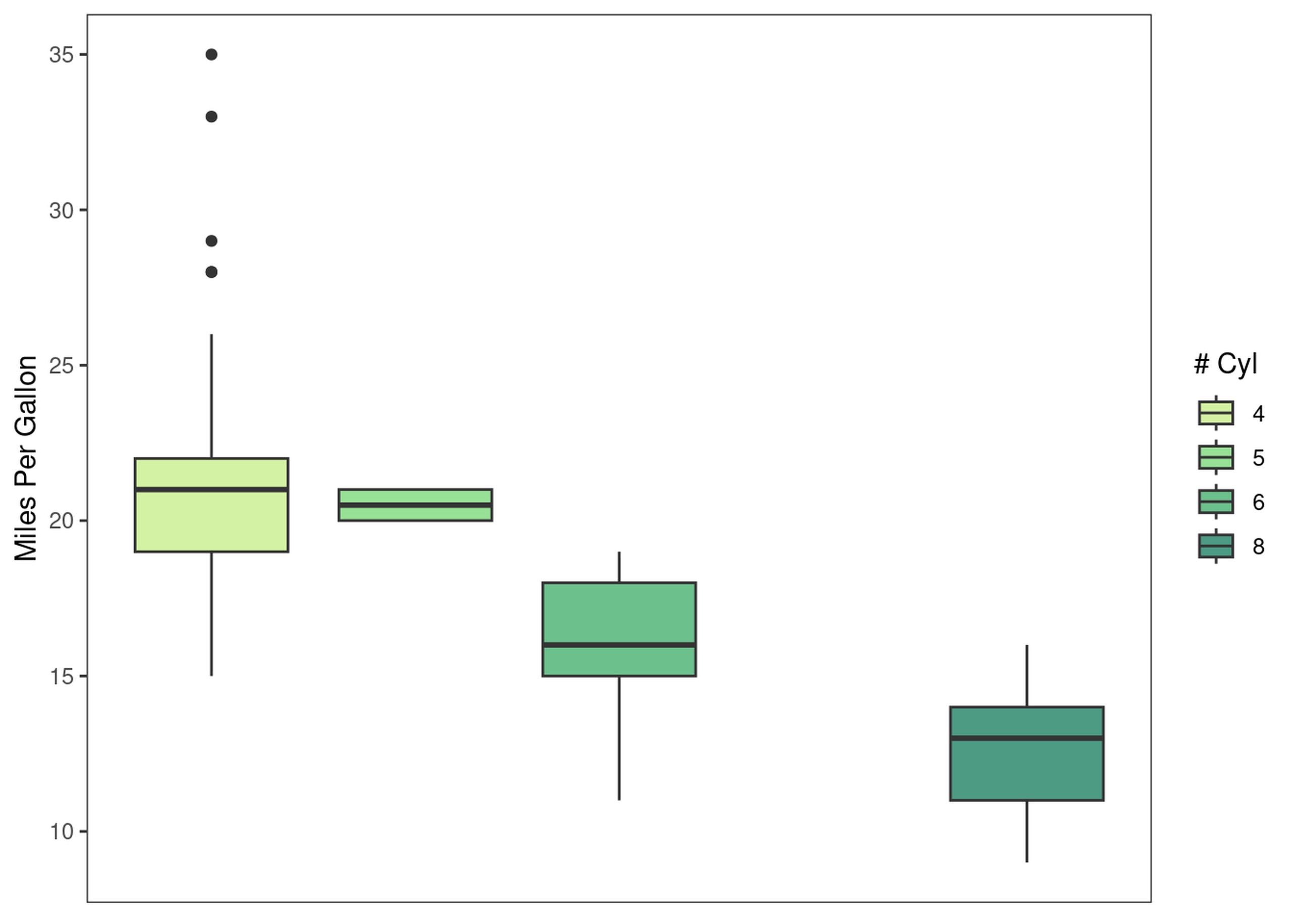
explot +
  paletteer::scale_fill_paletteer_d("rcartocolor::Emrld")
gg-genes!
Another ggplot extension package is gggenes, which enables plotting
gene annotations. First, let’s load some gene annotations. In most cases
we would load these from e.g. a GFF file, but for simplicity I’ve made a
little test CSV file.
genes = read_csv("data/genes.csv")
glimpse(genes)
## Rows: 42
## Columns: 5
## $ gene       <chr> "geneA", "geneA", "geneA", "geneA", "geneA", "geneA", "gene…
## $ individual <chr> "at01", "at02", "at03", "at04", "at05", "at09", "at10", "at…
## $ start      <dbl> 100, 120, 100, 100, 340, 100, 300, 100, 100, 350, 350, 350,…
## $ end        <dbl> 200, 200, 200, 200, 440, 200, 400, 200, 200, 900, 900, 900,…
## $ orthogroup <chr> "A", "A", "A", "A", "A", "A", "A", "A", "A", "B", "B", "B",…
gggenes primarily supplies geoms and themes designed for plotting
genes, so we start the plot as per usual with ggplot(). We then use
the geom_gene_arrow() geom to draw genes, and use the theme_genes()
theme to draw chromosomes rather than a typical Cartesian coordinate
system.
ggplot(genes, aes(y=individual, xmin=start, xmax=end, fill=orthogroup)) +
  gggenes::geom_gene_arrow() +
  gggenes::theme_genes() +
  labs(y=NULL, x="Position", fill="Orthogroup") +
  theme(legend.position = "bottom")
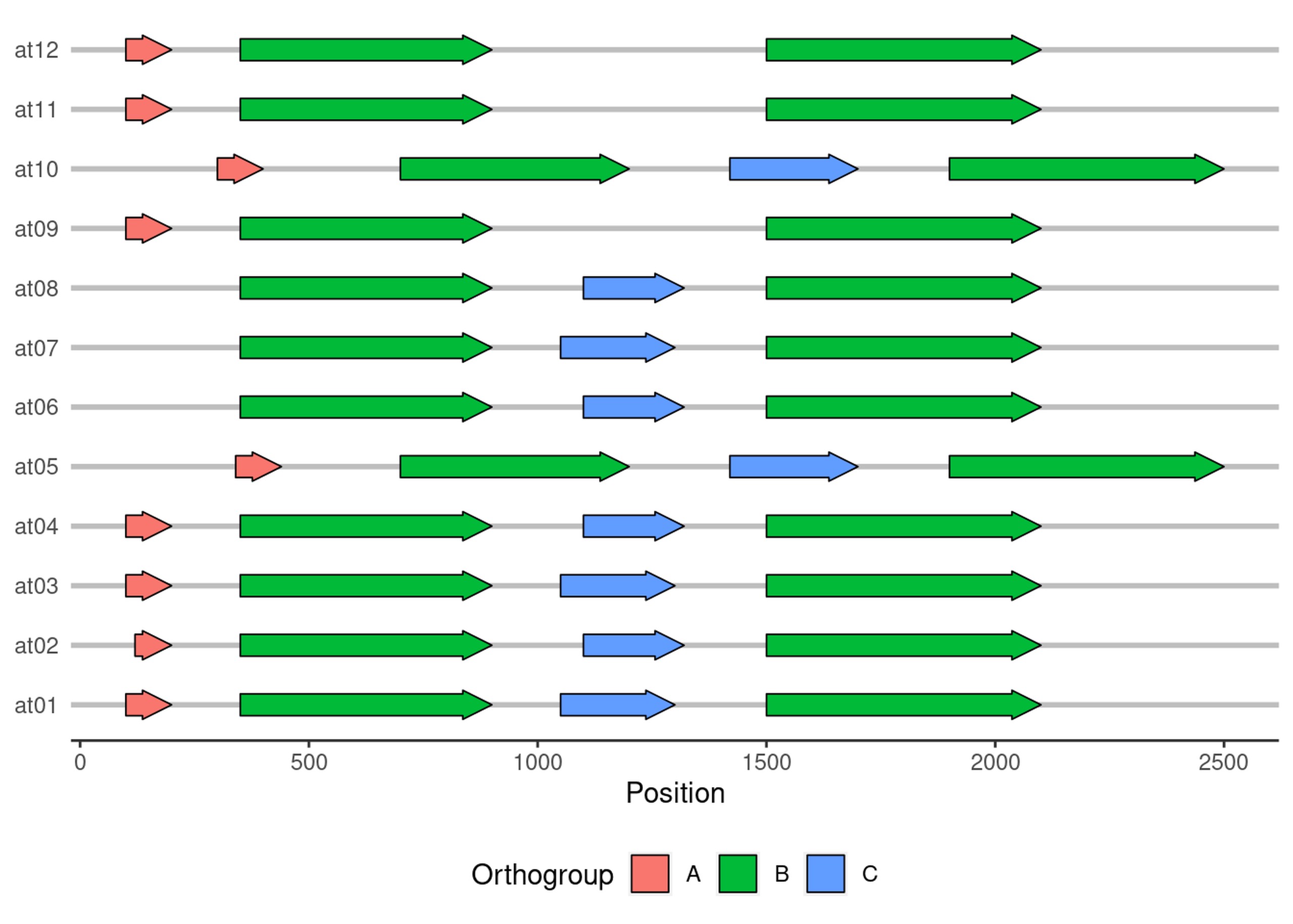
Pretty neat, eh!
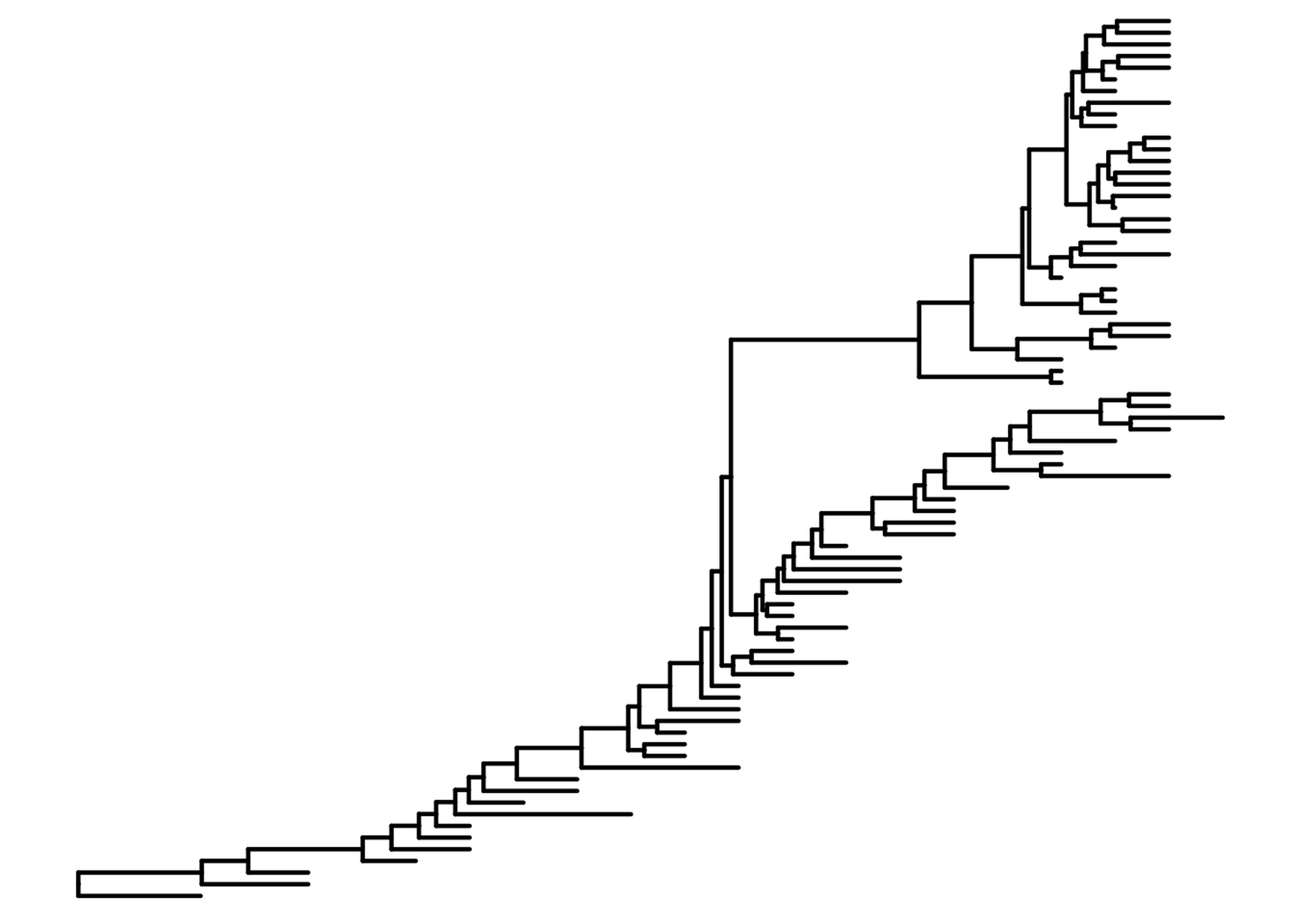
PhyloGGenies
Another common data type for biologists are phylogenetic trees or clusterings.
For simplicity of installation, we’re going to use the example data from the ggtree package, which is unfortunately about flu evolution rather than plants. But, DNA is still DNA, and a Newick file is still a tree.
library(ggtree)
library(treeio)
First, we read the BEAST tree in. We can plot this tree as a plain old phylogenetic tree:
flu_tree =  read.beast(system.file("examples/MCC_FluA_H3.tree",
                          package="ggtree"))

flu.p = ggtree(flu_tree, size=.8, mrsd="2013-01-01")
flu.p
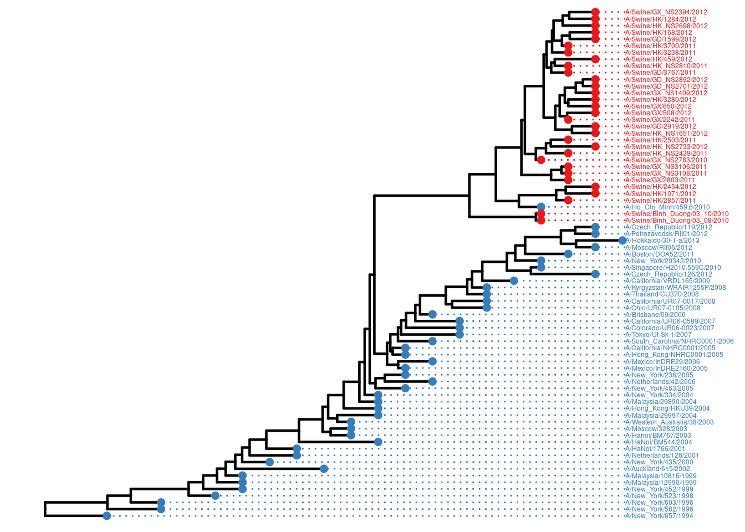
However the real power of ggtree is in annotating trees. For example, one common question is how some property of each tip/individual is spread over the tree. In this dataset, we have flu samples from both pigs and humans. Let’s adorn this tree with both tip points and tip labels, both coloured by host.
host = data.frame(tip=get.tree(flu_tree)$tip.label) %>%
    mutate(host=case_when(
      grepl("Swine", tip) ~ "Swine",
      T ~ "Human"
    ))
flu_annot.p = flu.p %<+% host +
  geom_tippoint(aes(color=host), size=2) +
  geom_tiplab(aes(color=host), align=TRUE, size=1.6, linesize=0.5) +
  scale_color_manual(values = c("#377EB8", "#E41A1C"), guide='none') +
  scale_x_ggtree() +
  ggplot2::xlim(NA, 2016)
## Scale for x is already present.
## Adding another scale for x, which will replace the existing scale.
flu_annot.p
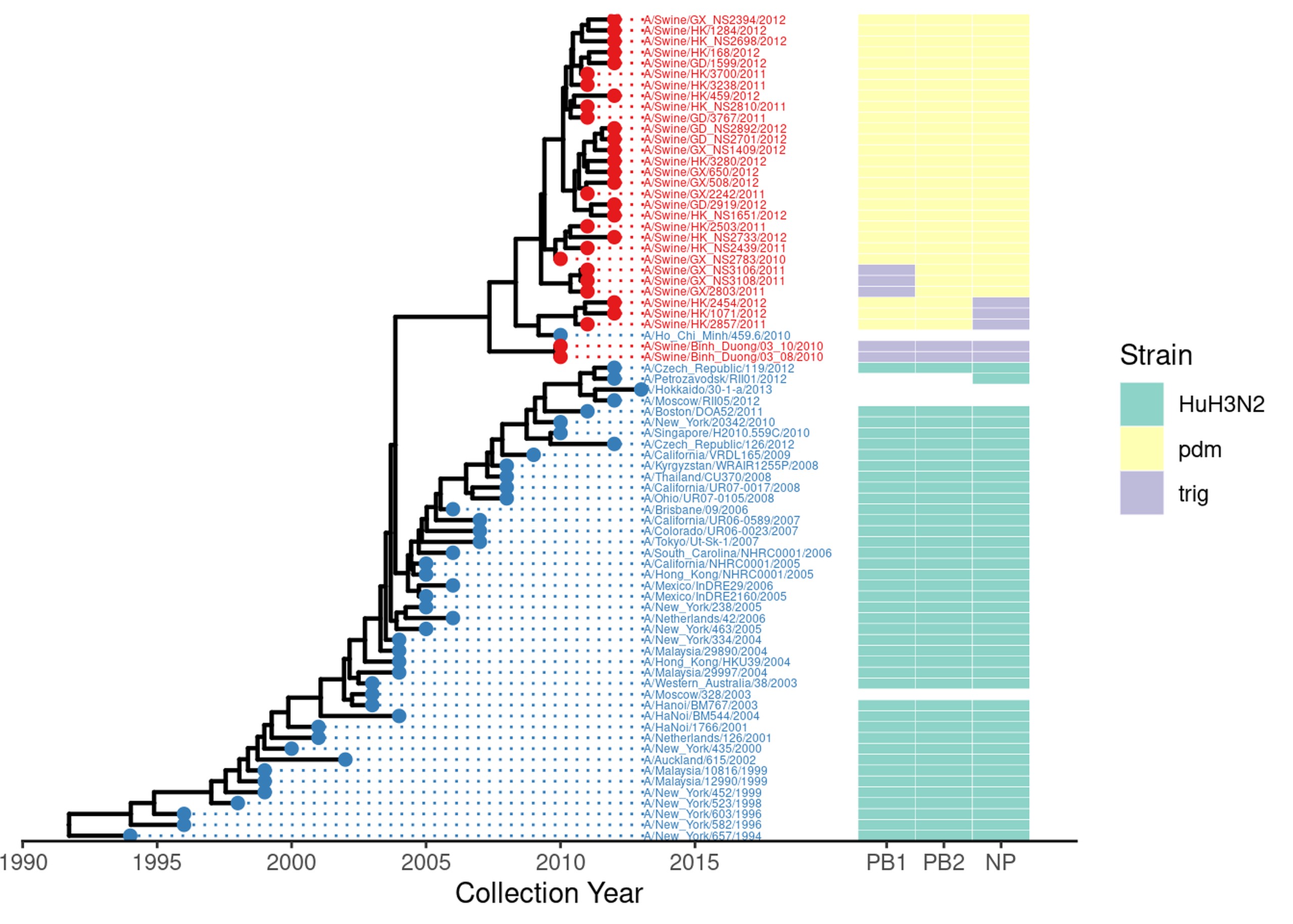
But that’s not all we can do. There might be several measures or properties we’d like to plot alongside the tree. One way you can do that is using a heatmap. Here, we plot the flu subtype, as genotyped by various markers.
geno =  read.delim(system.file("examples/Genotype.txt", package="ggtree"), row.names=1, sep="\t") %>%
  dplyr::select(PB1, PB2, NP)

gheatmap(flu_annot.p, geno, width=.3, offset=7, colnames=F, legend_title = "Genotype")  +
  scale_x_ggtree() +
  scale_fill_brewer(palette="Set3", na.translate=F) +
  theme_tree2() +
  labs(x="Collection Year") +
  guides(fill=guide_legend(title="Strain"))
## Scale for y is already present.
## Adding another scale for y, which will replace the existing scale.
## Scale for x is already present.
## Adding another scale for x, which will replace the existing scale.
## Scale for fill is already present.
## Adding another scale for fill, which will replace the existing scale.